
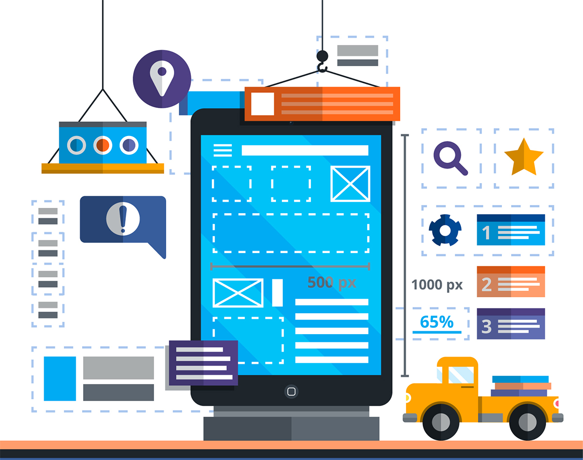
The ROI of your User Interface Design
Every dollar spent on User Experience Design can bring up to 100$ dollars in return. Nero Burning ROM Crack This a fact. We are all users of something and we get frustrated daily over a bad user experience of a website, email, software and how we try to get rid of it soon. There are only a few seconds before the user decides if go ahead with something or leave it (eventually forever) and the 70% of failed projects were due to a problem of user experience. It’s not the idea. It’s not even the hype around it. The secret is how you tell people how to use your product. If you fail on this, they will find an alternative and nowadays, alternative are everywhere.
 Your competitors are there waiting for you to lose some potential client.
Why User Interface Design Fail?
Let’s say you did all well. You decided to invest in the best UI ever and you hired a good professional for the job. A Graphic User Interface Designer has in his/her hand a lot of power. And a lot of stress to handle. Sometimes a professional with amazing ideas, skills and experience fails because time (the usually is the first metric to give value to a project) is not enough to communicate with the client, fully understand their expectation, translate ideas into Graphic Interface… That is why reducing the amount of tasks the designer have to perform and make every step easier can make the UI Design not only faster but also better. It gives to the designer time to focus on the user, to tailor the perfect experience for the target and use creativity to get a unique product. In this way the money invested in the project doesn’t go away “for the developing time”. You don’t have to pay for minutes and hours but to create the best environment for your users. This is how every dollar you spend will get you hundreds of dollars.The Economy of Attention
What is the most valuable commodity nowadays? Gold? Copper? Coltan? What is the most valuable asset for any business? Information? Capital? The answer is one: attention. Any business needs clients and to attract clients we need to get their attention. Unfortunately attention is rare lately: people is overwhelmed, overstimulated by information, content, advertising, messages, notification and it become numb to new stimulations. The top players of the IT world make their applications every day more catchy, more addictive keeping users always more attached to them. Your potential audience is already spoiled: they want it all and they want it immediately and if it’s not, they lose interest. This is why our economy is based on attention more than anything and a project can be made or end broken by 5 seconds more got or lost in the usage of an application or browsing a website. If you think you had an idea, if you think you found a solution for a problem, if you are sure that people would pay to use your solution first ask: “How the user gets to use the solution?” If using your solutions it’s hard you are not resolving a problem for anyone but creating one for yourself. How many clicks or tap you need to do before finalizing the operation? How many fields or forms you need to fill in order to make it work? How long does it take to understand how it work? How all the functionality of your solution looks graphically? All these, and more, questions, are mandatory for any project as softwares, app, web platforms, user interface of technological devices… If you want to succeed you need to keep the attention of your potential clients high while they start using your solution for the first time and not get them frustrated and lost. The battle now is all on user interface.:The Good, the Bad and the Ugly: a story of user interface development
Some time ago a designer was developing the user interface for a client. It was a software made to manage orders and supplies in an online store connected with different physical affiliate stores. Every affiliate would have used the software and the use of it was part of the “package” that they would by to get in the business The client wasn’t very clear about what he wanted so he asked to the designer to provide some different proposal. The designer created 3 different mock-ups:- One was showing ALL the features of the software, he called this “the Good”
- The second was showing just a couple of main features, hiding the others in submenus and links, but not showing the full potential of the software to new users, this was called “the Bad”
- Another one was showing more features but it was totally minimalistic and without any decorative detail , this was called “The Ugly”
Enters AI
This is where Artificial Intelligence created a breakthrough for User Experience Development. Before a designer that wanted to use a software needed to: learn how to use the software and all its options and featuresadapt his/her creativity to it create save frequently his/her own template to not lose any work already donerepeat over and over again millions of times boring tasks already performed before. AI can make this totally different… Softwares now can learn from the user how to perform tasks in the way the user is used to do. The software creates shortcut for you learning from the way you work, bringing you where you want to be without boring tasks to repeat. It allows you to focus on creativity and functionality. Artificial Intelligence makes a device able to understand the words you say in the microphone, the words you write on a piece of paper, a doodle that you did on that napkin in a café after a sudden inspiration…. Imagine to apply all of it, right now, to create the perfect User Interface for any project. Imagine starting to create and the more you create the faster your creation will become because your software learns more and more…increasing speed and quality There is an AI powered solution that can do all that and much more. An incredible tool for UI design that becomes better with time and make you able to design from sketches, words, voice… Do you want to know more? Come to know Adevi.You might also like
-

March 11 2022
-
January 11 2022
-

December 20 2021
Recent Post
-
Space Bar at the End of the Galaxy [Finished] - Version: Final
-
CREW 167 THE GRAND BLOCK ODYSSEY-CODEX
-
Helheim-RELOADED Download